

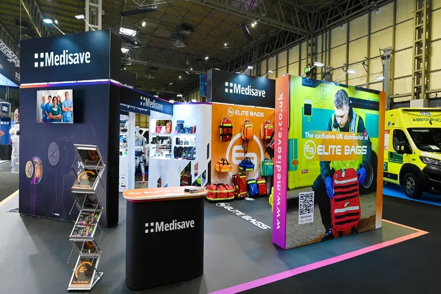
When an attendee walks past your booth at a trade show, you have roughly three seconds to capture their attention and communicate your value. During that fleeting moment, your signage either works or it doesn’t. The most effective trade show signs share a critical characteristic: they answer one central question that visitors unconsciously ask themselves as they move through the exhibition floor. That question is simply, “Why should I stop here?” When your signage provides a clear, immediate answer to this question, you transform casual foot traffic into genuine leads and meaningful conversations.
Understanding the Trade Show Environment
The trade show floor presents a unique communication challenge that differs dramatically from traditional advertising contexts. Hundreds or even thousands of attendees move through the space simultaneously, many of them already mentally fatigued from walking and absorbing information. Your signage competes not just with your direct competitors’ booths, but with every visual stimulus in a crowded, overstimulated environment. Attendees make rapid decisions about which booths deserve their limited time and attention, often relying on subconscious cues from your signage.
Understanding this environment means recognizing that attendees are not reading lengthy product descriptions or contemplating your company history. They are scanning for relevance. Your sign must function as a filter that quickly determines whether your booth addresses their specific needs, challenges, or interests. When signage fails to answer the fundamental question of relevance, even high-quality design and production cannot overcome that weakness.
Make One Promise, Make It Clear
The cardinal rule of effective trade show signage is simplicity through singular focus. Your primary sign should communicate exactly one core value proposition or benefit. This discipline forces you to identify what truly differentiates your offering and what would most motivate someone to engage with your booth rather than continue walking. For example, if your company reduces production costs for manufacturers, your sign might state that primary benefit directly rather than listing cost reduction, quality improvement, and faster delivery times all together.
Clarity means using language that your target audience immediately understands without interpretation or guesswork. Avoid jargon specific to your industry unless your audience consists entirely of specialists who use that terminology daily. When in doubt, assume your audience is encountering your company name for the first time and has limited context about what you do. The language should be direct and concrete rather than abstract. A sign that reads “Saving manufacturers 30 percent on materials” communicates more effectively than “Innovative solutions for operational excellence.”
Use Visual Hierarchy to Guide Attention
Even the most brilliant headline loses impact if it competes visually with secondary information. Effective trade show signs employ visual hierarchy, meaning the most important message dominates the visual space through size, color, contrast, or placement. Your primary headline should occupy the most prominent real estate on the sign, with secondary information like your company name or booth number playing a supporting role. This hierarchy ensures that someone viewing your sign from across the trade show floor encounters your core message first.
Color selection contributes significantly to visual hierarchy and attention capture. High-contrast color combinations make signs more legible and memorable than low-contrast options. The specific colors should connect logically to your message or brand identity rather than feeling arbitrary. A sign using bright, contrasting colors will draw the eye more effectively than a monochromatic approach, but the color choice should still feel intentional and professional. Typography also plays a crucial role; select fonts that prioritize legibility over decoration, particularly when attendees view your sign from a distance.
Test Your Message Before the Show
Before printing expensive signage, validate that your message actually resonates with your target audience and clearly answers the central question of why someone should stop. Share mockups or prototypes with colleagues, clients, or members of your target market and ask specifically whether the primary message is immediately clear. Ask them to state what they think your company does and what benefit you are offering based solely on the sign. If their answers do not match your intention, your signage needs revision. Companies testing new messaging at multiple events throughout the year often rely on trade show displays for rent to evaluate how different sign configurations and layouts perform in real exhibition conditions before committing to a permanent setup.
Testing also extends to readability in different lighting conditions and from various distances. Trade show floors often feature mixed lighting, from bright overhead lights to shadowed corners. A sign that reads beautifully in a design studio might lose legibility under typical trade show lighting. Consider how your colors, fonts, and contrast perform when viewed from ten feet away, twenty feet away, and from an angle. Making these adjustments before the show prevents disappointment when you arrive and discover that your signage does not function as intended in the actual environment.
Strategic Sign Placement Amplifies Impact
Even brilliant signage fails if attendees cannot see it clearly because it has been positioned awkwardly or blocked by booth furniture. Your primary sign should be positioned at eye level for someone standing outside your booth, not above their heads or down at table level. The sign should face the main traffic flow of the exhibition floor, allowing approaching attendees to see your message as they navigate toward you. Many booth mishaps result from signs positioned toward the booth interior or facing away from the most likely traffic patterns.
Consider creating multiple signs for different purposes within your booth space. A large, high-impact sign visible from a distance serves one purpose, while smaller secondary signs can communicate additional information or direct traffic to specific areas of your booth. This layered approach allows you to maintain singular focus on your primary message while still providing supporting details for attendees who engage more deeply with your booth. The placement of these secondary signs should guide the visitor’s journey logically through your space without overwhelming them with too much information at once.
Conclusion
The most effective trade show signs succeed because they answer one question instantly and clearly: why should an attendee stop at your booth? This clarity emerges from identifying your single strongest differentiator, communicating it in language your audience understands, and presenting it with visual hierarchy that ensures your core message dominates. Testing your message before the show and positioning your signage strategically amplify the impact of this focused approach. In the fast-paced trade show environment where attention is scarce and decisions are rapid, the power of answering one question instantly separates signs that generate genuine engagement from those that fade into the background noise of the exhibition floor.
